
Highlight: Product + Critical Thinking - Speculative
Categories: UX Research, UX, Design Thinking, Touched on CX
Roles: User Researcher, Product Designer
Participants: 5 qualitative interviews
Tools: Figma for the design process; Flowmapp for the CJM; Google Sheet for feature priority; Web Inspector/Code Editor for visual UX/UI mockups; Maze for usability test
Duration: 1.5 weeks, 60 hours in April 2020
*** Note: Speculative added feature project, no affiliation with the brand ***
Airbnb offers vacation rentals, homes, experiences, and places. They offer unforgettable experiences to guests. Problem: So how can hosts and guests look trustworthy to one another while Airbnb mediates? Scope and Constraints: The time limit to produce an added feature to the Airbnb website was 1.5 weeks or approximately 60 hours. Completing user recruitment and remote user testing within the limited timeframe was a challenge. The scope revolved around solving the problem. To produce the new feature, I applied UX design, Design Thinking, CX design, and various other methods throughout the project stages. Challenges Faced: I encountered a few challenges while completing this project. One challenge was establishing a focal point for customer experience design since the results of the research study were quite broad. All the research participants had very different customer experience in North America, Europe, and Asia. Their cultural norm wasn't a big factor in how well their experience was. Also, fourth-fifths of participants had to recall their experiences from more than one year ago and they had trouble recalling fine details. There was also a learning curve while applying the newly learned skills of Design Thinking and Customer Experience Design. I had assumed personas, customer journey maps, competitive analysis, and wireframe sketches would be similar to past projects. Also, I thought following Airbnb's existing design system would be easy but it was not easy. I was uncertain to follow the design system because as I was drafting the UI to add the feature, I found the most updated colour palette from the web inspectorAirbnb Experience Reviews
Prologue: The customer is always right in the service industry. It depends...
Use your common sense for booking on Airbnb.
I did one-on-one phone interviews and teleconferencing calls for user research. I collected data from 5 participants to understand their Airbnb experience. None of them were aware of Airbnb’s safety and trust statement and one had a negative experience. Travelers were generally more concerned about the lodging experience. As long as there was enough door security and they were in a safe neighbourhood, they were satisfied, until something was to happen. At the end of the interviews, my research participants were left wondering how safety and trust work on Airbnb. Research findings breakdown: Two new features Airbnb offers as of 2020 are: My formed hypothesis based on hearing the 5 research participant's stories: I established the following goals for the newly added feature for three parties: Guests, hosts, and Airbnb stakeholders. These goals will improve the usability for (g1), (g2), and (g3).Research Definition
In general, participants preferred the Airbnb brand to offer budget-friendly rental spaces for travel experiences and the aesthetic of the site drew them into using the product. Fourth-fifths participants disclosed they won't use online experiences. None of the first batches of participants has disclosed what they think about the front-line stays because they have not gone to use the Airbnb site recently.How fast the communication between guests and hosts is the perceived sense of “safety” and choosing cleanliness is their “blanket of comfort" in selecting an Airbnb stay.
for All-Women Trip: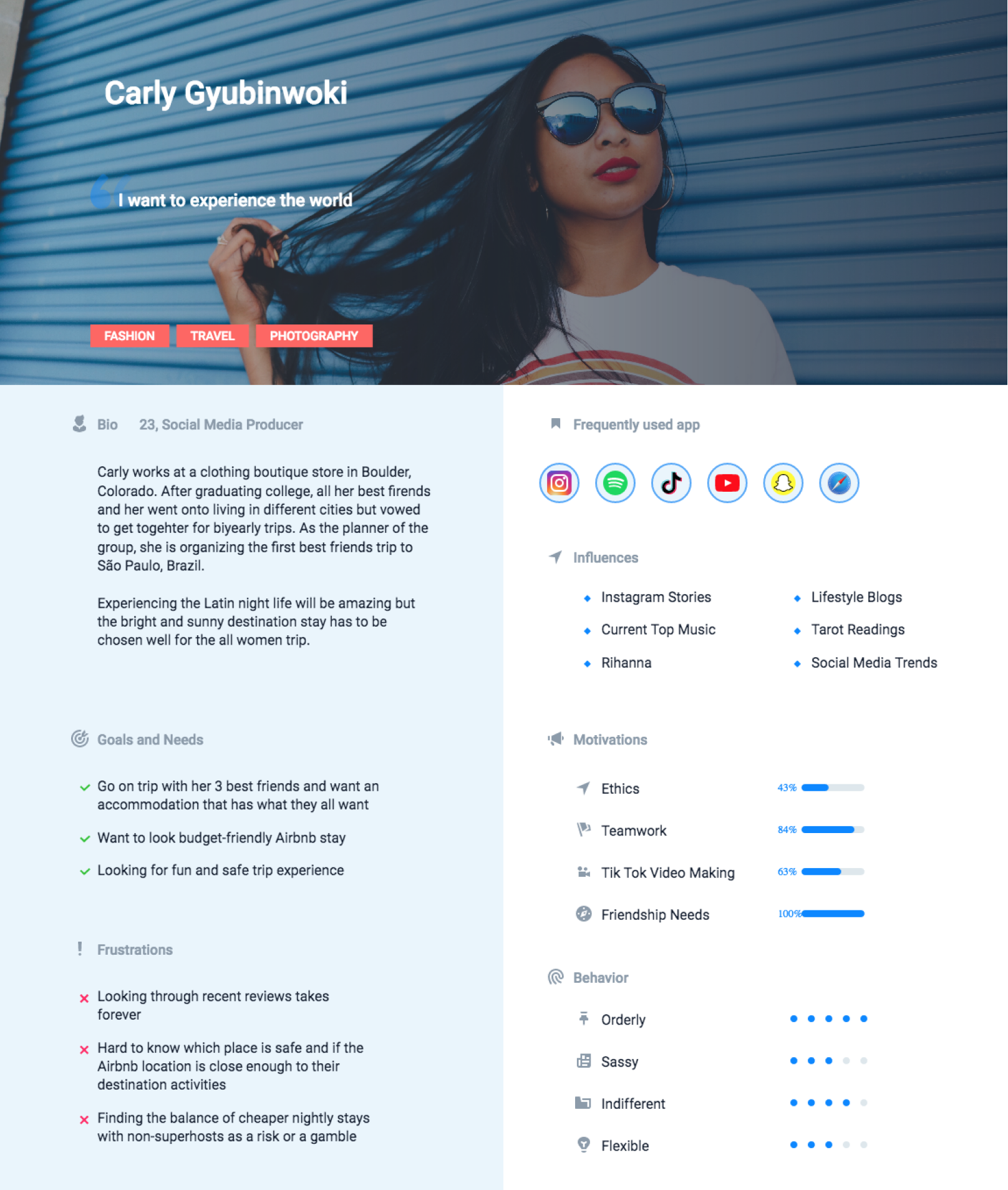
from Looking at Airbnb
Places to Stay
to Going Back Home: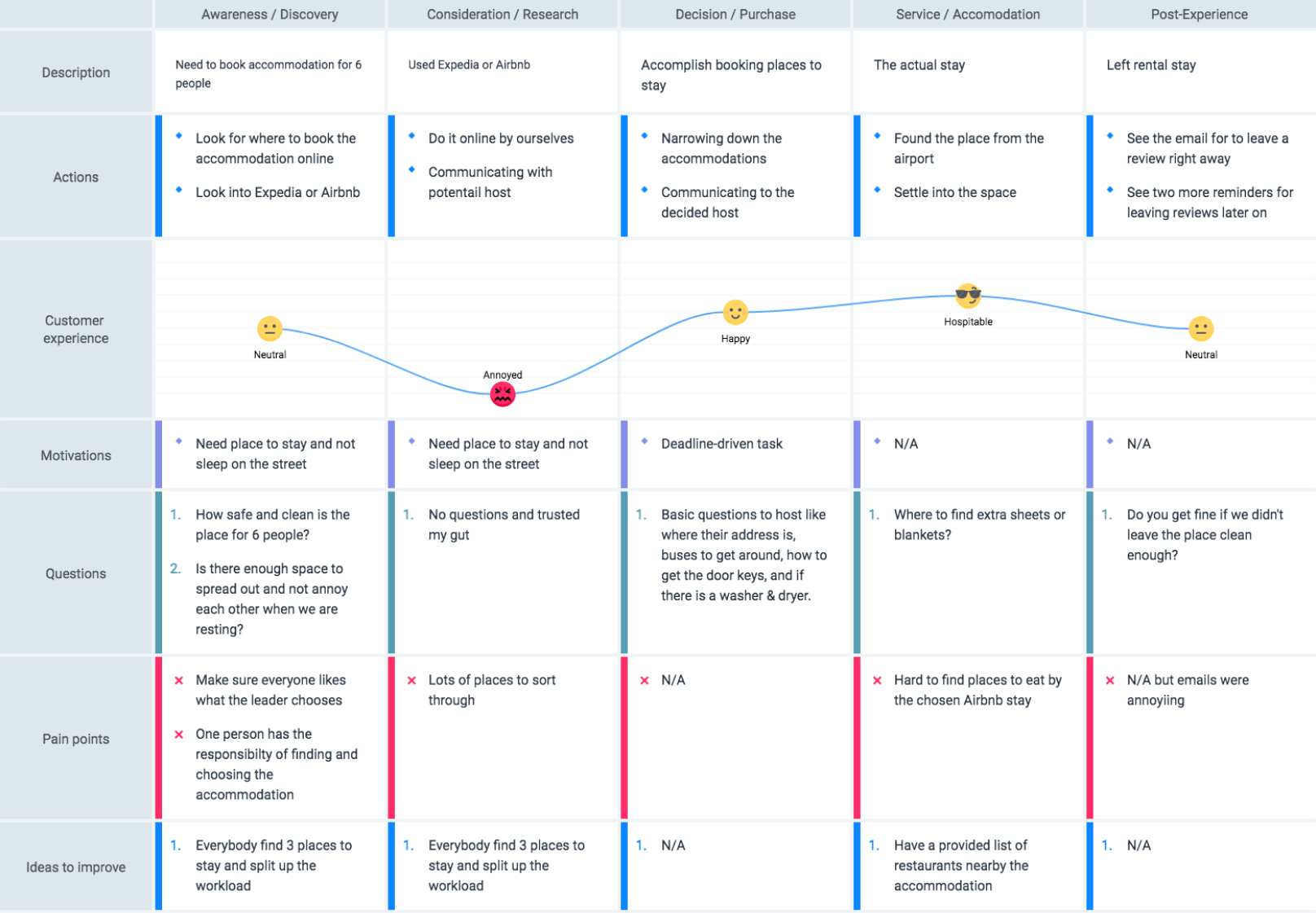
in the Business Model: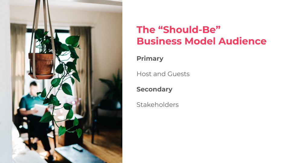
Solution Planning
Priority to Solve
the Design Problem: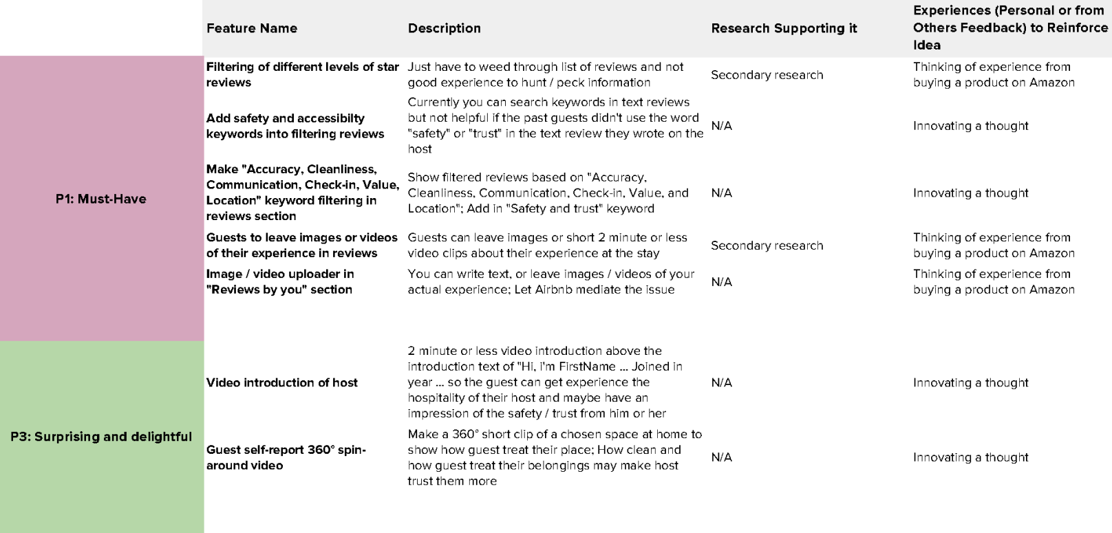
My innovative thought was that guests can add video reviews from their Airbnb stays to give other Airbnb users honest feedback. Word-of-mouth marketing is very valuable and if a company allows that to be on their platform it generates more trust from users to your brand. I am aware that Airbnb guests or hosts have the option to write reviews about each other and that reviews are posted after a specific time. Some reviews may not appear on hosts' profiles due to how untrustworthy the guest is. Also, I extended the video idea to other parts of Airbnb content such as being able to filter a rental space’s hero media gallery. My thoughts were that hosts can post virtual tours of their property. Self-discovery and secondary Google research gave me a few surprises. My first surprise was that Airbnb hosts have been requesting a video upload feature be added since as far back as 2016. No video upload exists at this time. The possibilities of this backlog may be other features were more important or simply too many videos will slow down the website and mobile app platform. From my one-on-one user interviews, for one to decide on which Airbnb host to stay at, they have at approximately 10 rental listings open to looking at reviews. They looked for the most recent reviews, and for cleanliness. I also did a rough check-in with my user participants and asked how long it took them to look through reviews. The users with a laissez-faire attitude took about 1 to 2 hours. The users wanting a good experience took a few hours more and if you multiply that by 10, then you have a very grumpy traveller before they even get there. My second surprise, the Airbnb site, and the app is missing usability for reading through reviews. Their search function for looking up keywords in text reviews was not consistent across the responsive website and mobile app. I ran a usability check from PowerMapper and it resulted in a benchmark of 71%, which is undesirable in business.
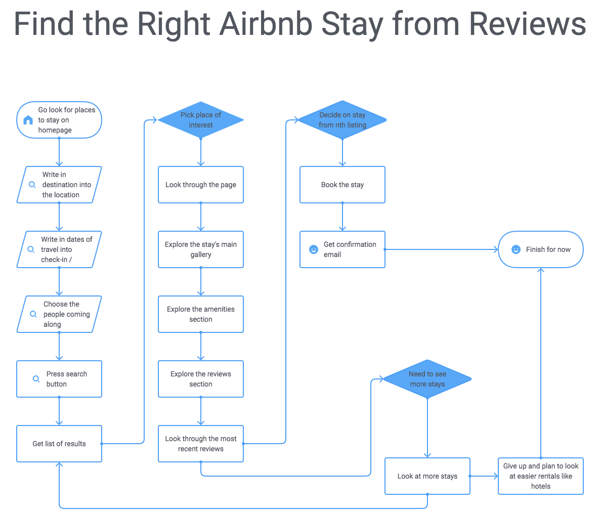
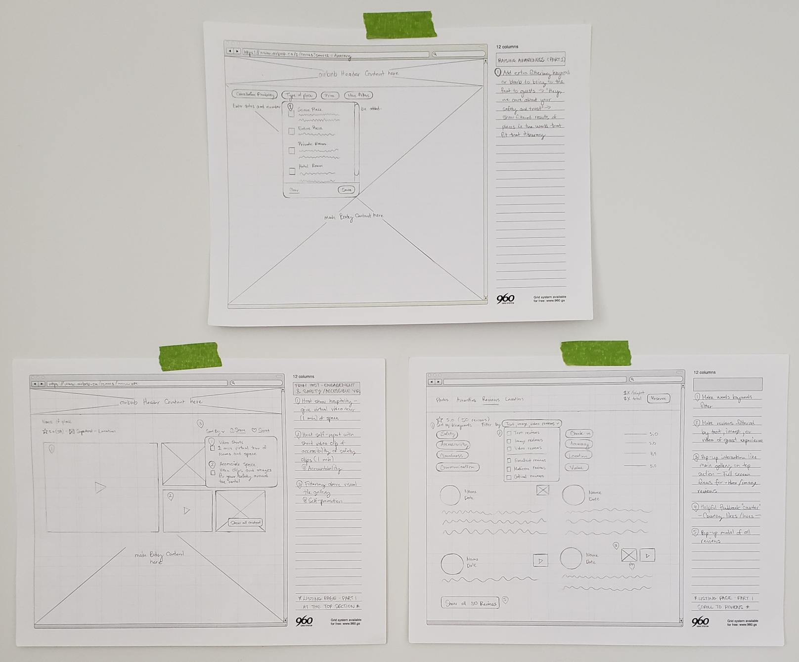
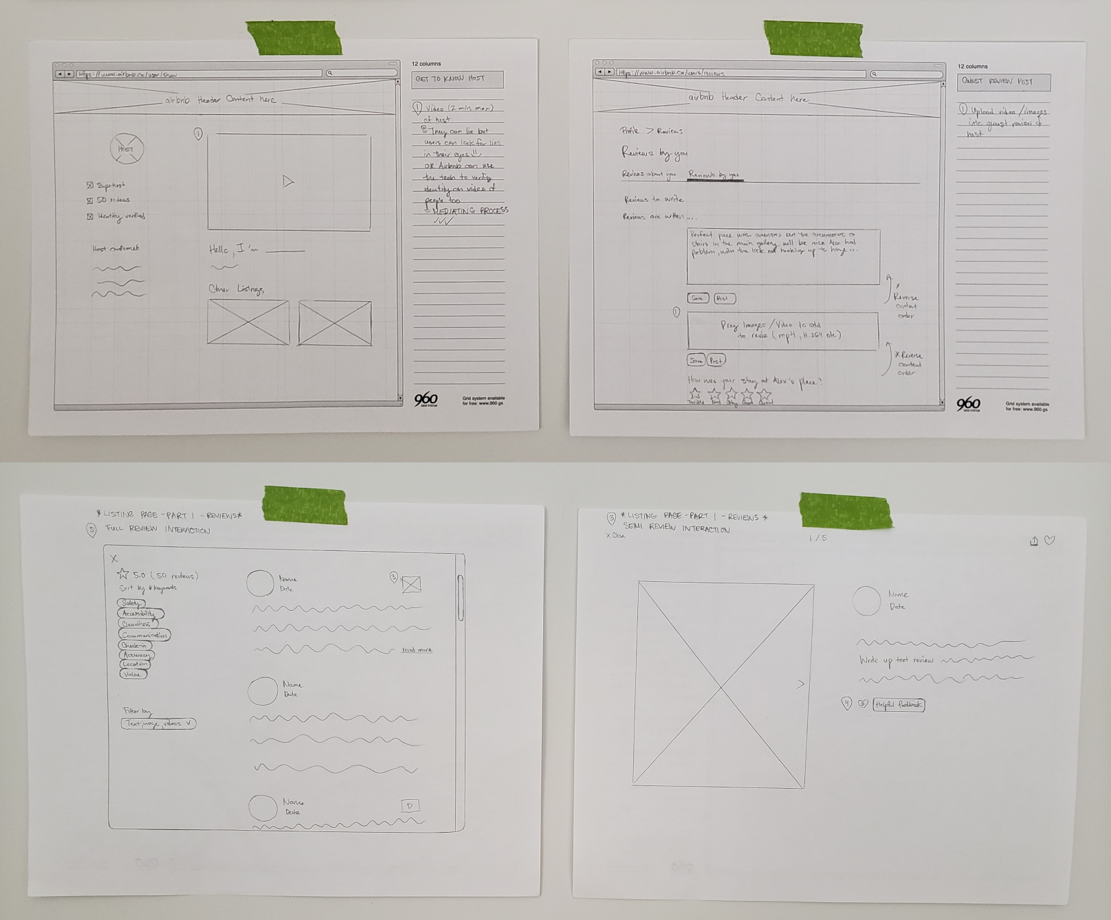
I focused on adding the video feature to the desktop website because research participants from the one-on-one interviews preferred to use the website to view Airbnb stays more than the app. Many of the participants used the app to chat or check-in with the host. I gathered many screenshots after I played with the HTML and CSS DOM to give a realistic sense of how the UI, and interactions can look. The other reason I did this was that Airbnb used Circular, an expensive font, and I didn’t want to invest in the font. I progressed production to “Photoshop” the visuals in Figma and set up my user testing environment in Maze. I conducted 15-minute user testing sessions of the prototype. Users searched and filtered through reviews and I gathered feedback on how useful the new feature was to participants. Following the initial testing, I did a 5-minute user testing observation to see how they normally search through reviews in Airbnb stays. From those 2 analyses, we did one-on-one feedback sessions to see what work and didn’t work for them.Solution Execution
Sidebar: The first slide in the carousel refers to the #1 note, and points correspond as you click to the next slides...
I learned that innovating design thinking is not hard, but all the ideas are out there already. It takes time if you don’t have a solution to the problem. I found it was challenging to test users with the feature. My polled research participants think the video review was great and liked the idea. I question if they will use it on their own time because some humans say and do opposite things. When I was observing how they search reviews in user testing, their recall of how to use the Airbnb interface was challenged. They don’t use the site often, and Airbnb is constantly making changes to its website and app.. From this project, I learned more about the Peak-end rule. The annoying part of looking for Airbnb stays was generally affected by usability in searching. The safety factor was invisible to potential guests and to lessen their frustration, I made adding the image and video uploads available to them when they write reviews. The images and videos from past guests will create comfort for new guests. I also observed the advertised cost per night of a rental was lowered when you clicked into the Airbnb stay. Self-reflection: Is this an ethical sales call or beneficial savings for users? If time permitted, I would do the following tasks: ← BC Blind Sports Accessibility - Long Writeup hikeIt - Long Writeup →Outcomes and Lessons