Highlight: Web UX/UI + Sustainable Joy - Side
Categories: UX/UI, Web Development, Branding
Roles: Web UX/UI Designer, Front-end Developer, Brand Storyteller
Tools: Figma, Photoshop, React Compiler, Firebase, Web Inspector, Code Editor
Duration: 2018 with periods of iteration
View: Hi-Fi Prototype (User not signed in), Hi-Fi Prototype (User signed in)
*** Note: Side project ***
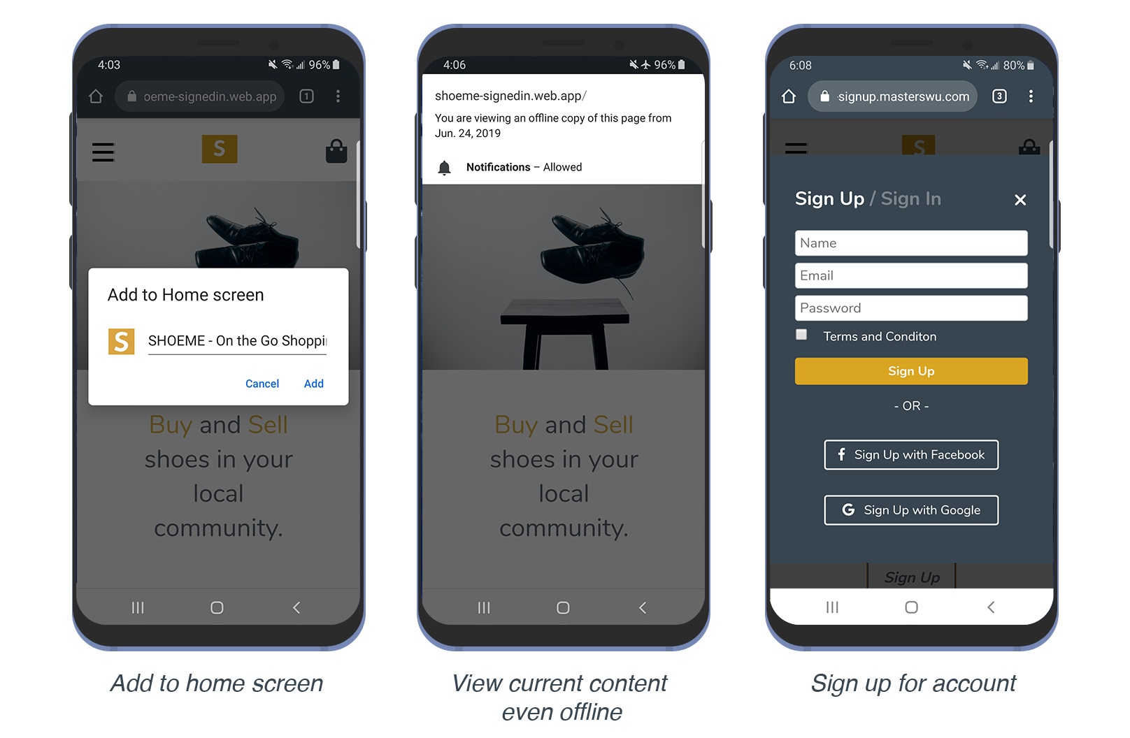
SHOEME is a thrift company that allows local communities to buy, and sell their never worn, or used shoes. The PWA brings app-like features so users can shop offline while on the go, and receive push notifications as well. Problem:SHOEME PWA
Prologue: The Designer/Developer took the bottom-up approach to build the components in React before the design.
We have too many unworn or old shoes.
From ideation to building the web app, I focused on “eating the frog,” where React code was approached first, for searching and filtering products. I applied it to sorting condiments, but from rough user feedbacks, I learned that people will shop for things they like only on the go, thus the idea changed to shoe shopping on the go.Process


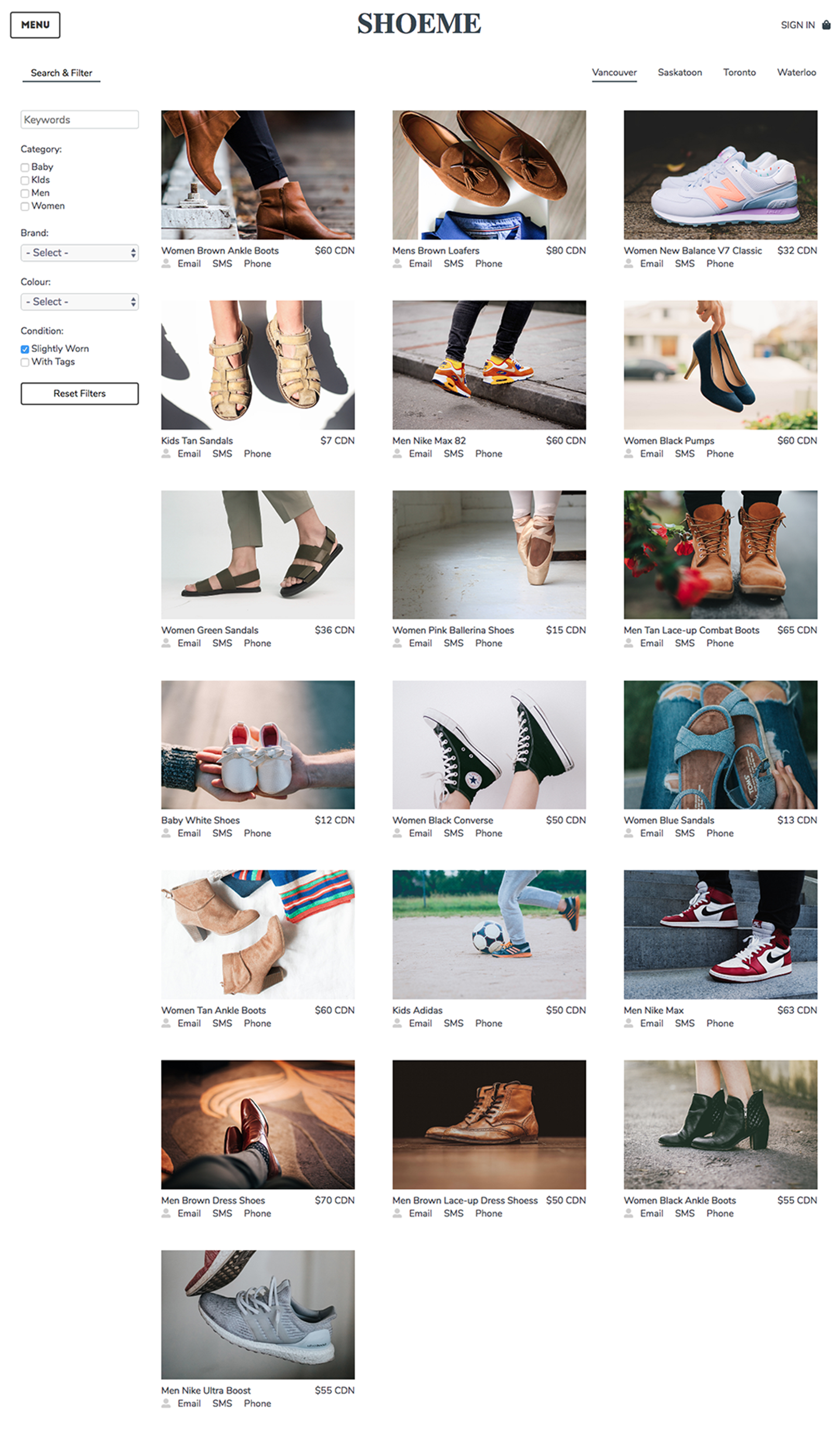
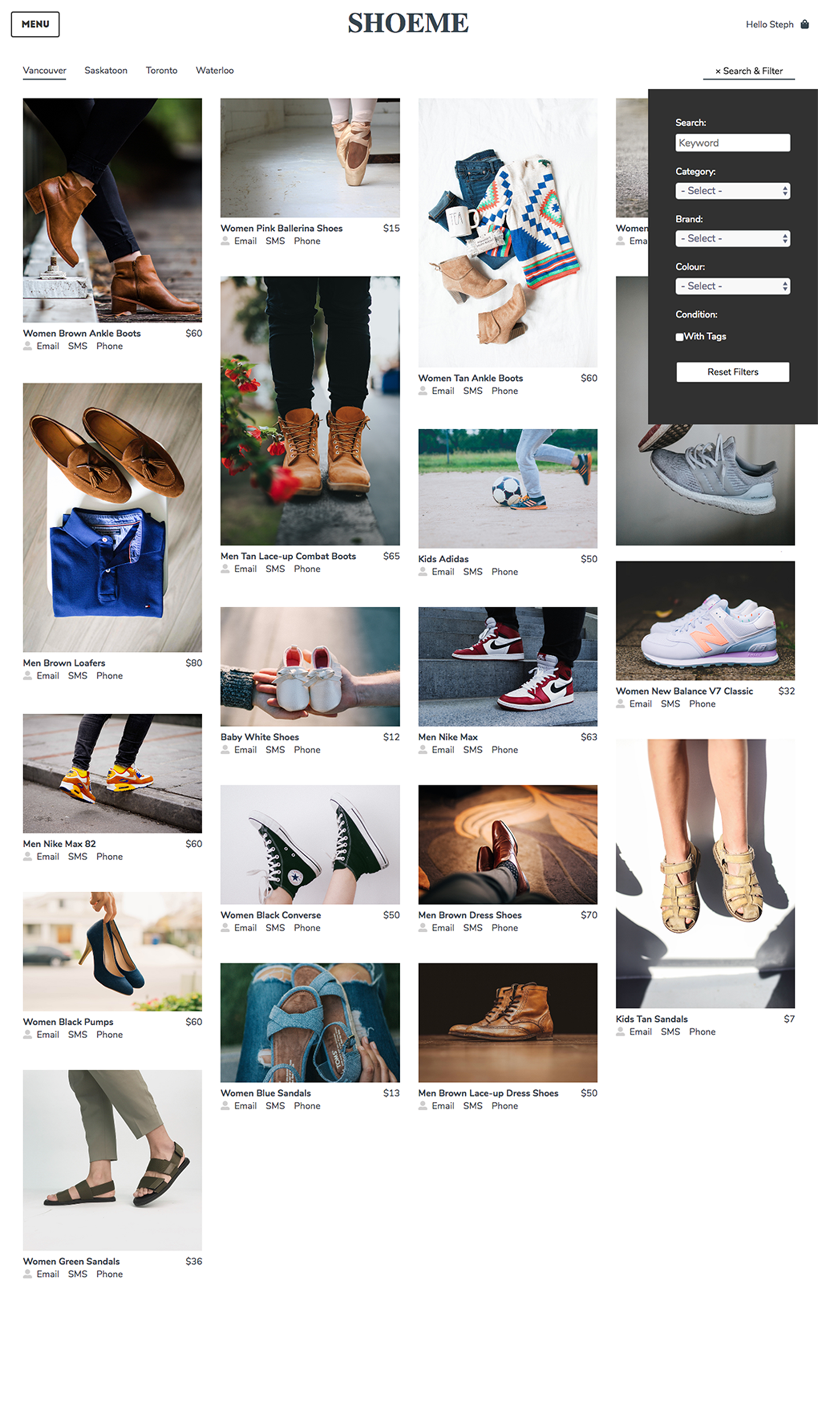
With the 2 UI mocks, the Pinterest style is more visually appealing to users, but is not more user-friendly in searching products, whereas the grid layout was a standard choice for e-commerce sites. With that in mind, I chose to stick with the standard for user-friendliness, plus the grid layout had more maintainable code with CSS grid. The iOS and Android devices had to have specific CSS for the form styles and CSS grid fallback.

User Scenarios:
(User signed in): User tries to explore how to use the search, add items and remove items from the wishlist
The challenges I have encountered were performance (loading the list of shoes to buy), responsive design for the CSS grid, and security of personal contact info. To maximize performance, I minify the files and cache the files with the service worker. Loading more shoe inventory than the prototype seems less feasible and may need to be rethought. Using the new CSS grid was also a challenge to code for cross-browsers, especially iOS, and IE Edge. Flawed by the bottom-up approach were the extra time and UX debt if there was a misstep. The good thing about this approach is great for growth in learning skills and tasks you wouldn't believe you could do. Essentially a project can be approached no matter where it is in the lifecycle. At the end of the day, it's all about the time it takes to do iterations.
Lesson
