
Highlight: Design Thinking + Collab - Side
Categories: UX Research, UX/UI, Design Thinking, Branding
Roles: Co-User Researcher, Android UX/UI Designer, Brand Storyteller
Participants: 39 quantitative surveys with project partner, 5 qualitative interviews by me
Tools: Adobe XD for research definition UX artifacts and prototyping; Sketch for final visual UX/UI comps; Figma for quick "Photoshop" crops and tints; Flowmapp/Whimsical for research definition and solution planning UX artifacts
Duration: ~ 4 weeks in May - June 2020, and planning sprints in 2021
*** Note: Passion project, Used Product/Project Manager methods to understand shipping a product ***
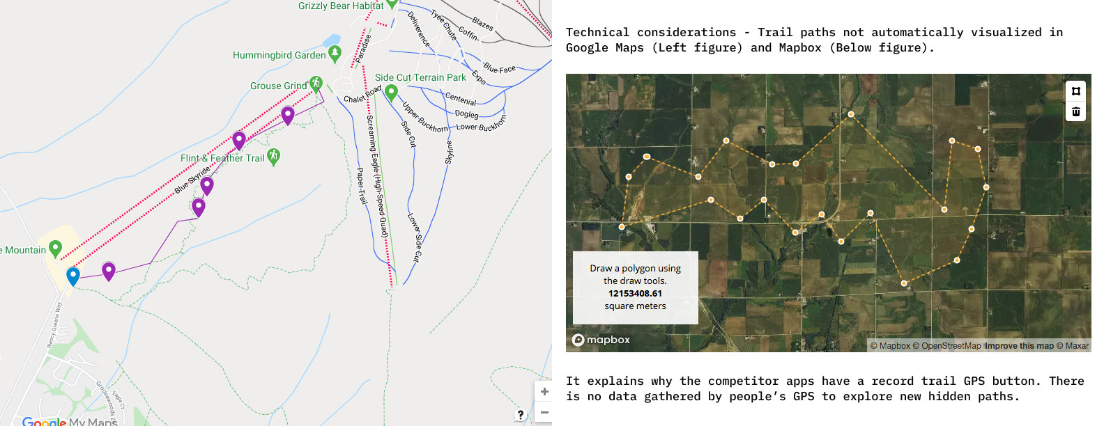
The team behind hikeIt wants to explore how the hiking experience shifts when they hike with people they don't know, or at the same/different hiking level as them. The group hiking culture in Hong Kong and South Korea is very strong and the app explores the idea under the North American hiking culture. North American hiking culture has a different mindset. Hiking independently and safety is what they are attuned for, thus, the hikeIt idea was born. hikeIt is a social proof-of-concept app to build personal growth and wellness. Problem: Scope and Constraints: The time limit to produce a custom mobile app in about 2 weeks' time frame was hard to manage. I tried to balance and manage what I can do as I'm not the sole design stakeholder of the project, I have another designer working with me and awaiting my UX Design for iOS. Challenges Faced: I considered using third-party APIs to extend the main apps technical load. For example, I considered open-source APIs to track the fitness aspect. Using third party APIs will increase the legal liability of any errors occurred during the hiking experience, so I had to be careful. Also, the technical barrier of not being to draw curved hiking paths on Google My Maps was a concern. The short answer to the challenges faced was the app process was ambiguous and I as the problem-solver had to weave around the roadblocks.hikeIt App
Prologue: As children, we blew bubbles and let them pop for fun. As adults, we hold the precious bubble and not break it.
We don't hike with people outside our comfort zone after 35 years old approximately. We don’t hike with anyone outside our network of close friends, work or family.
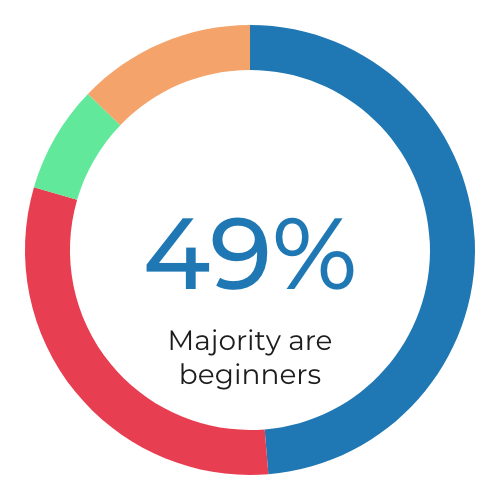
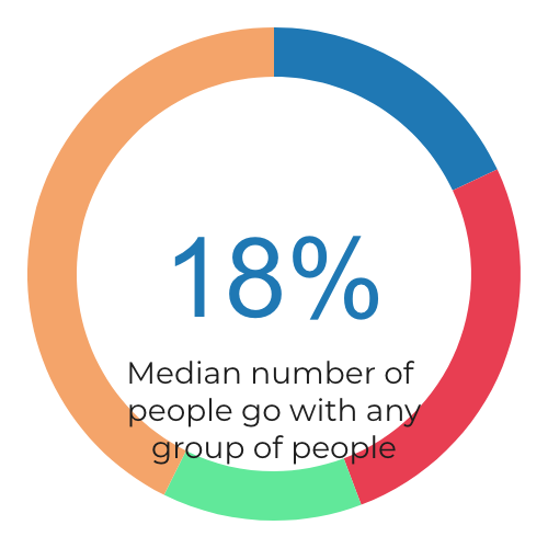
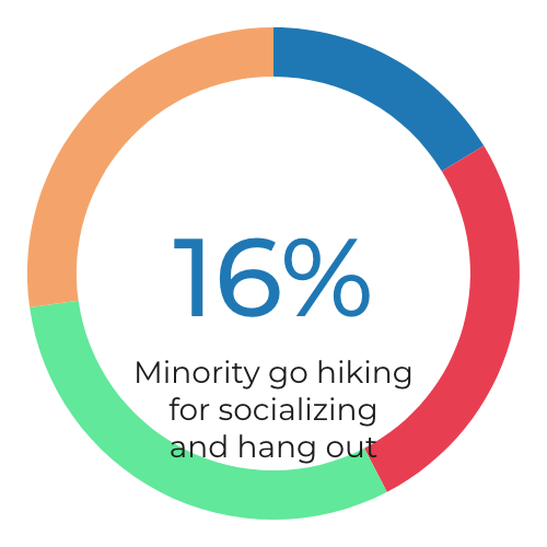
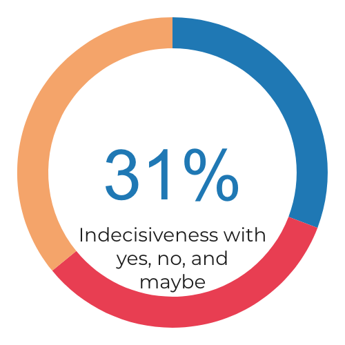
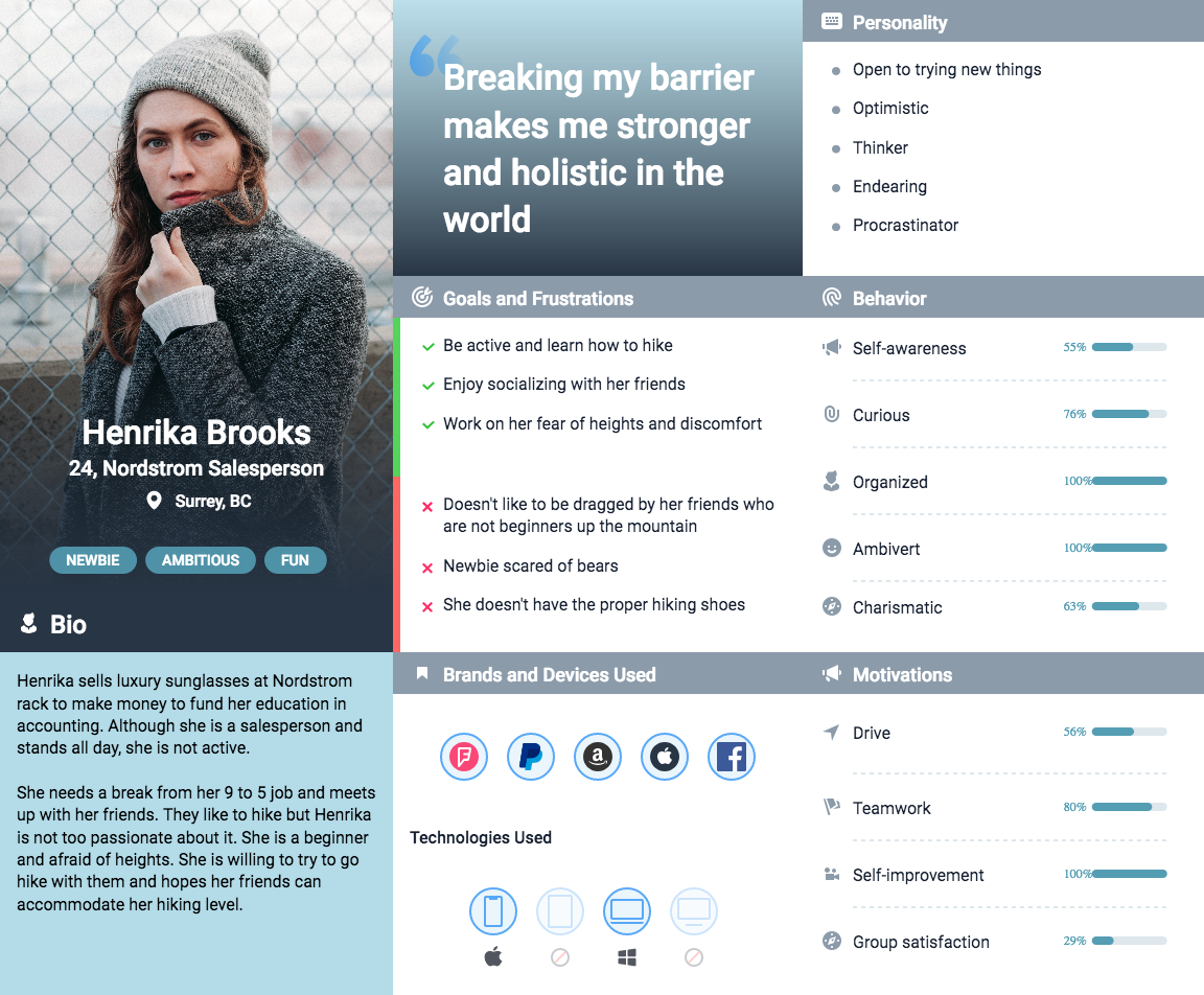
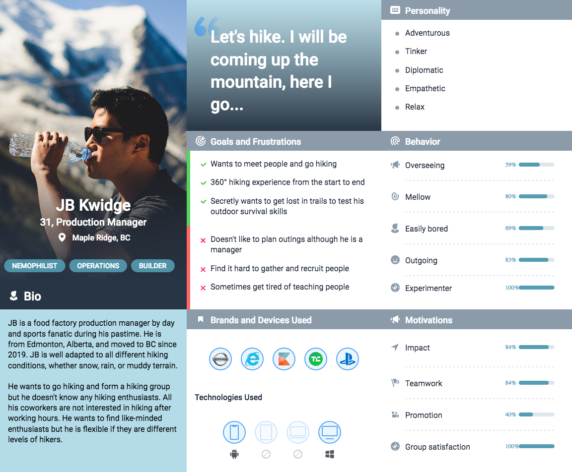
My design team member and I both recruited 39 participants from Google surveys to gather qualitative data. I followed up further with 6 one-on-one phone interviews. The core UX phase was left to me to progress since my other team member specialized in UI animation. My research goals were: The proof that British Columbians like hiking as their pastime was supported by the research findings. What level of hiker are you? Who do you go hiking with? Why are you hiking? How comfortable are you with carpooling with people you don’t know? My formed hypothesis based on hearing the overall research:Research Definition
Going together up the mountain in rideshare is the comfort breaking point people are willing to live with on the hiking experience.
British Columbia, Canada: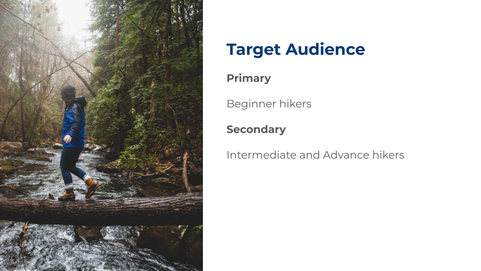
Solve the Design Problem: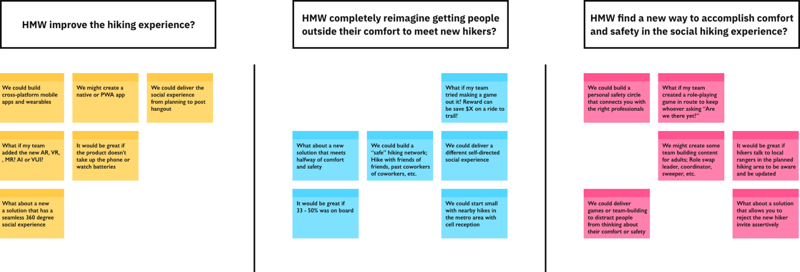
& Affinity: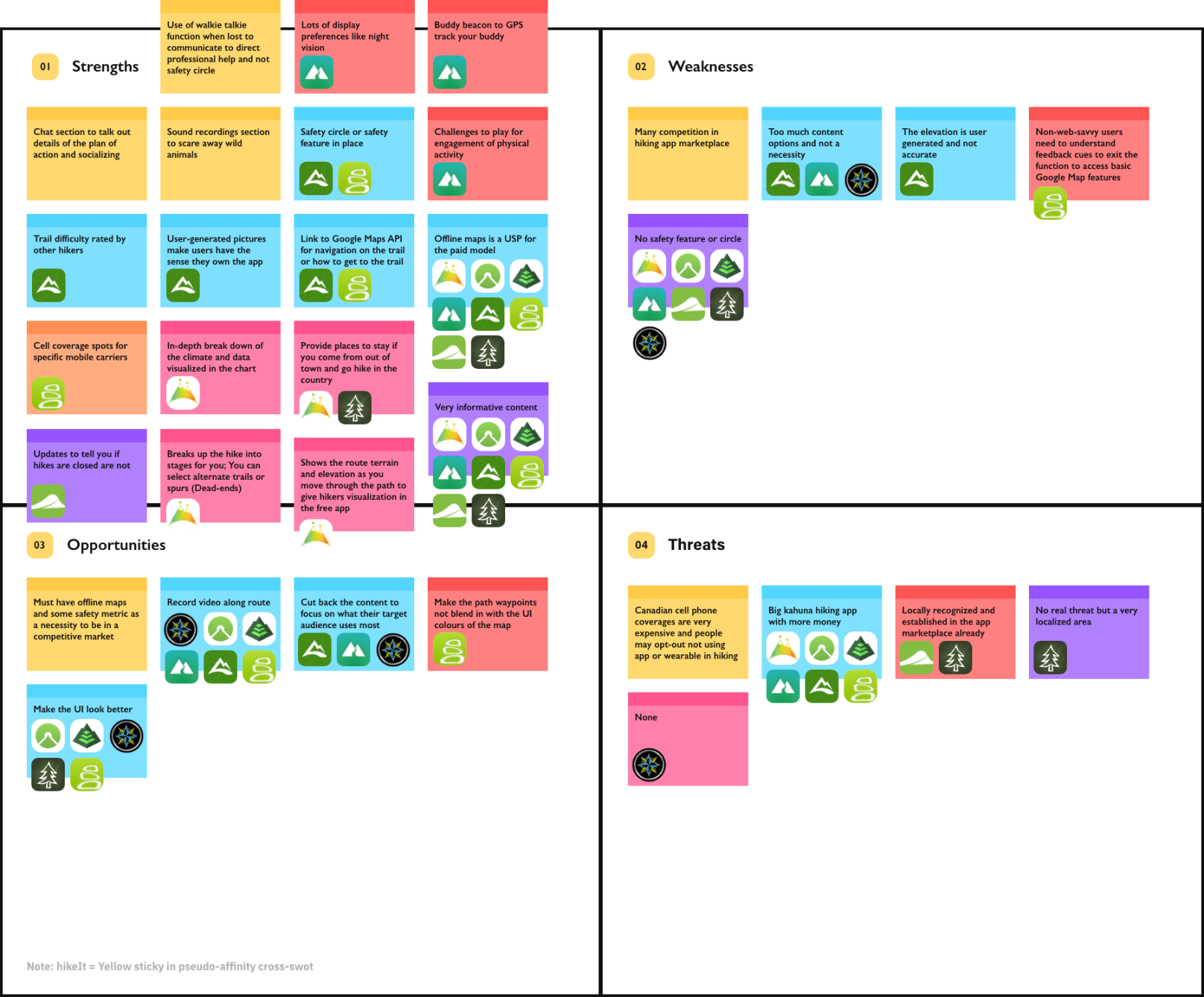
Solution Planning
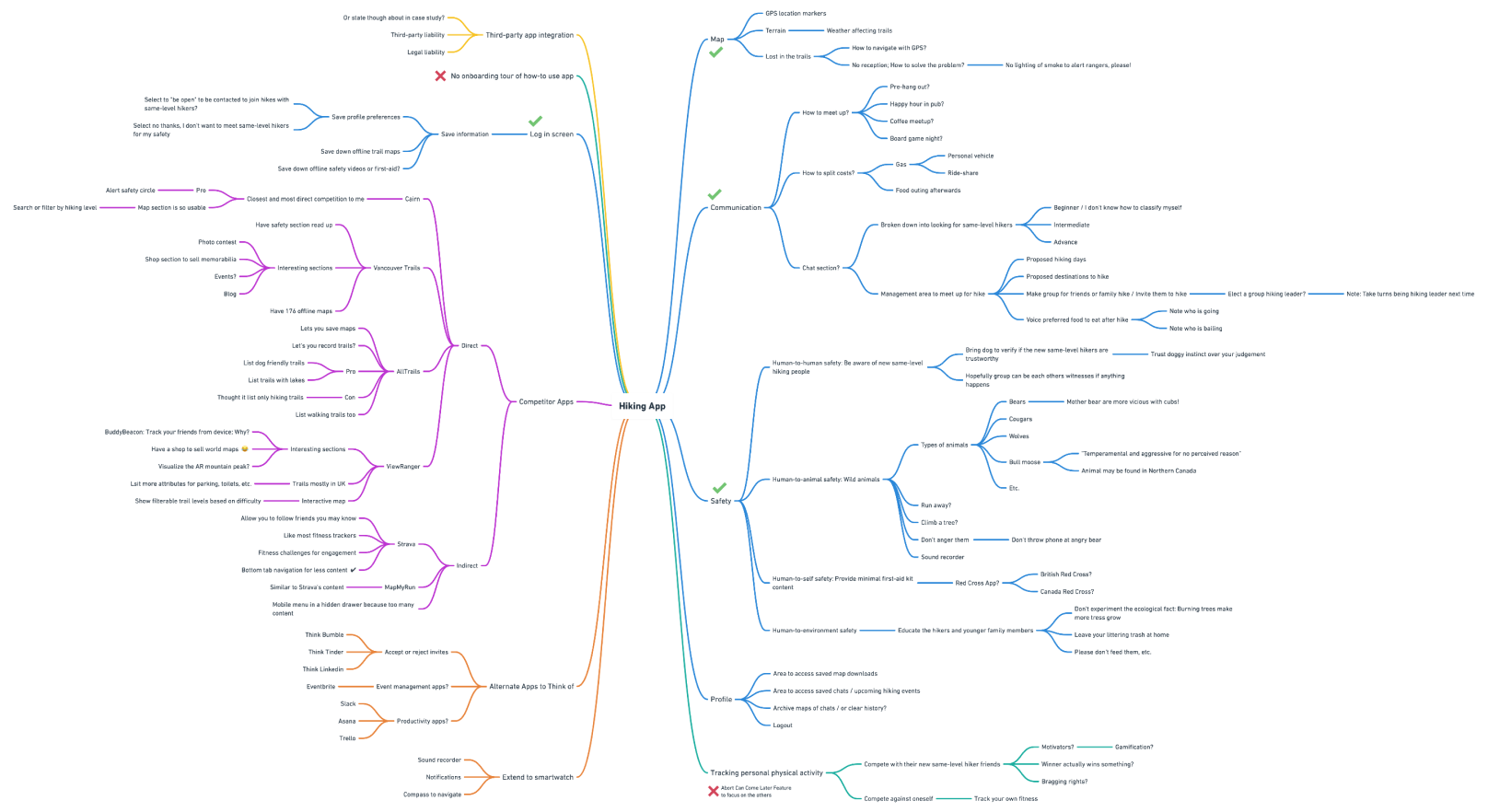
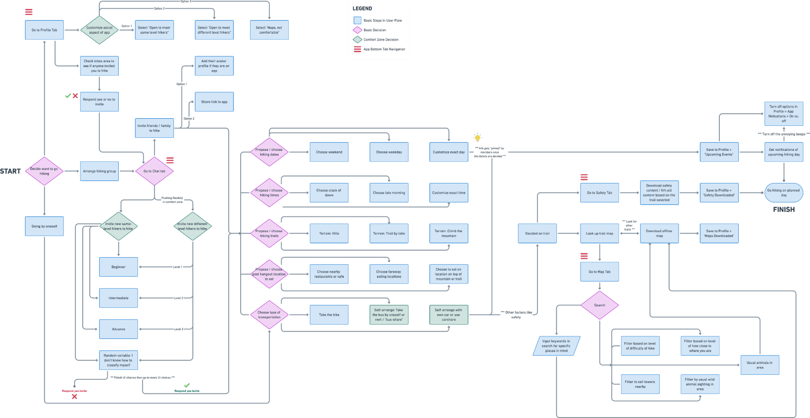
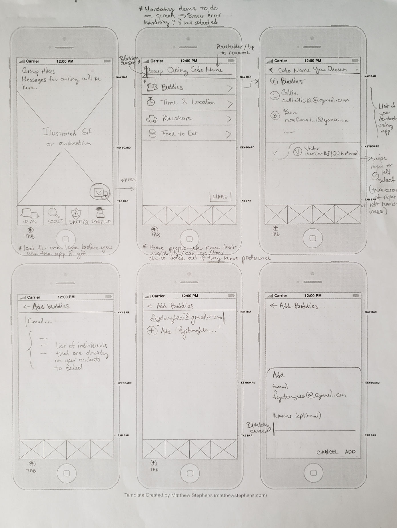
I made the mindmap to come up with more ideas for the app and preliminary feature roadmap. I had direct, indirect, and alternative competitor apps in the mindmap itself. Then I made the mashup SWOT and affinity map. I used the affinity diagram method to organize the competitive analysis and define the app's USP (Unique Selling Proposition). Also, I attempted a user flow chart of the whole app to get a better sense of the big picture and think of the UI previz. My low fidelity sketches made me see the functionality more and consider the technical constraints for developer handoff.
Solution Execution
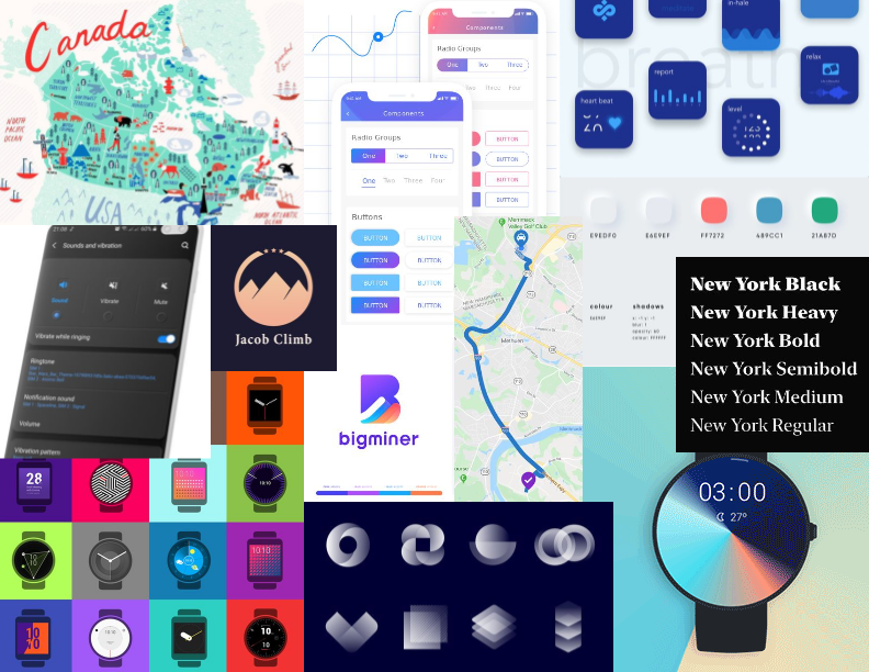
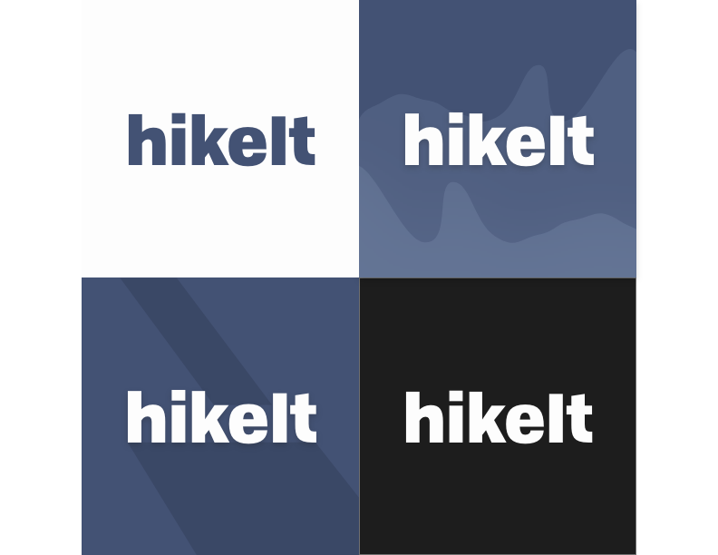
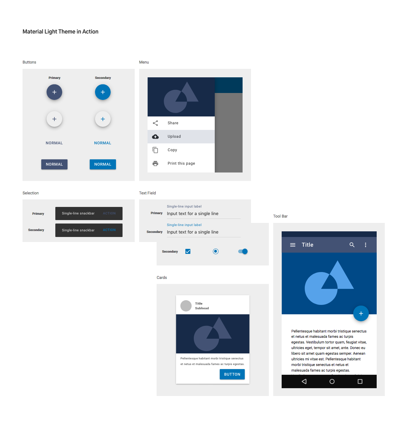
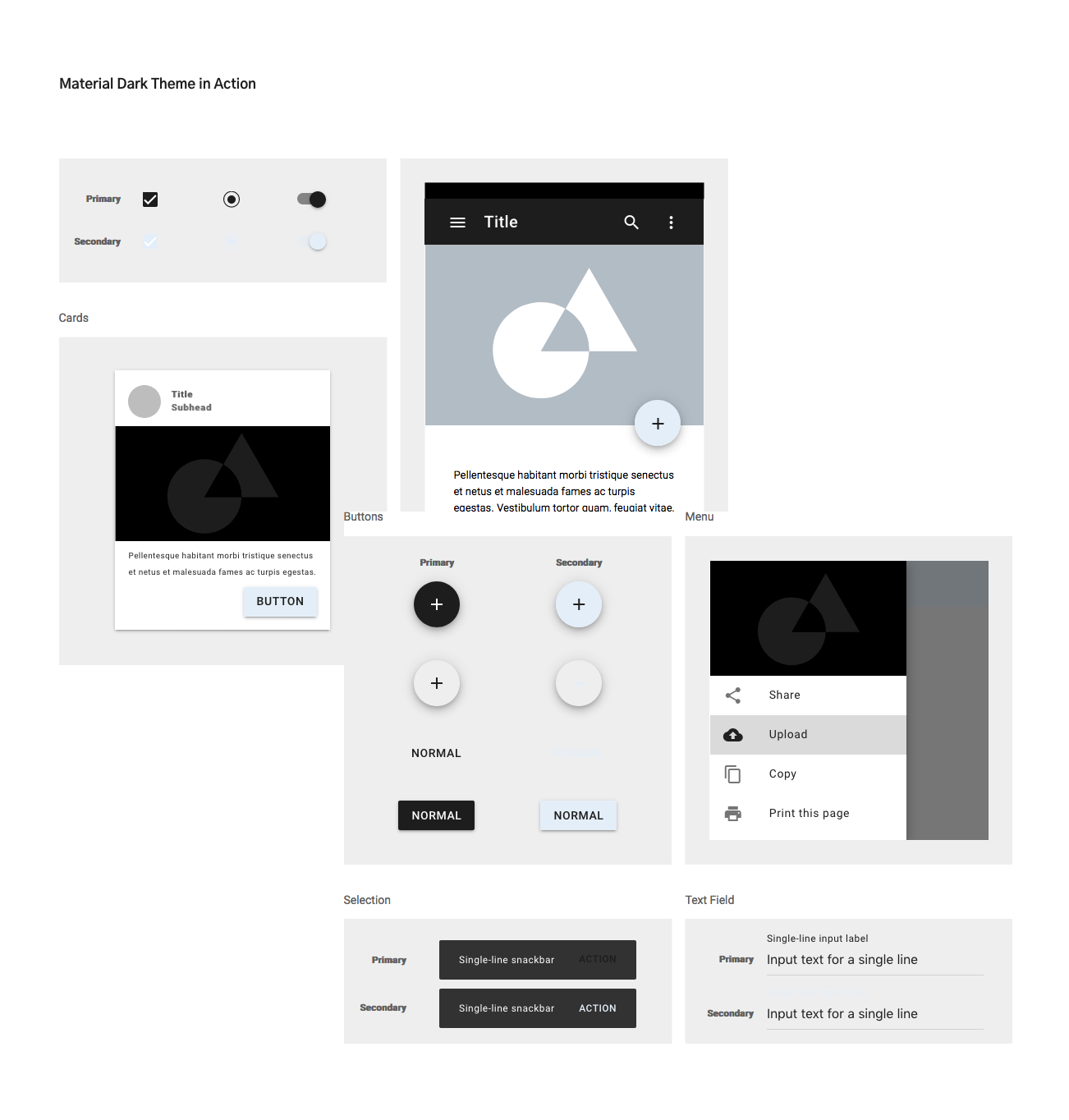
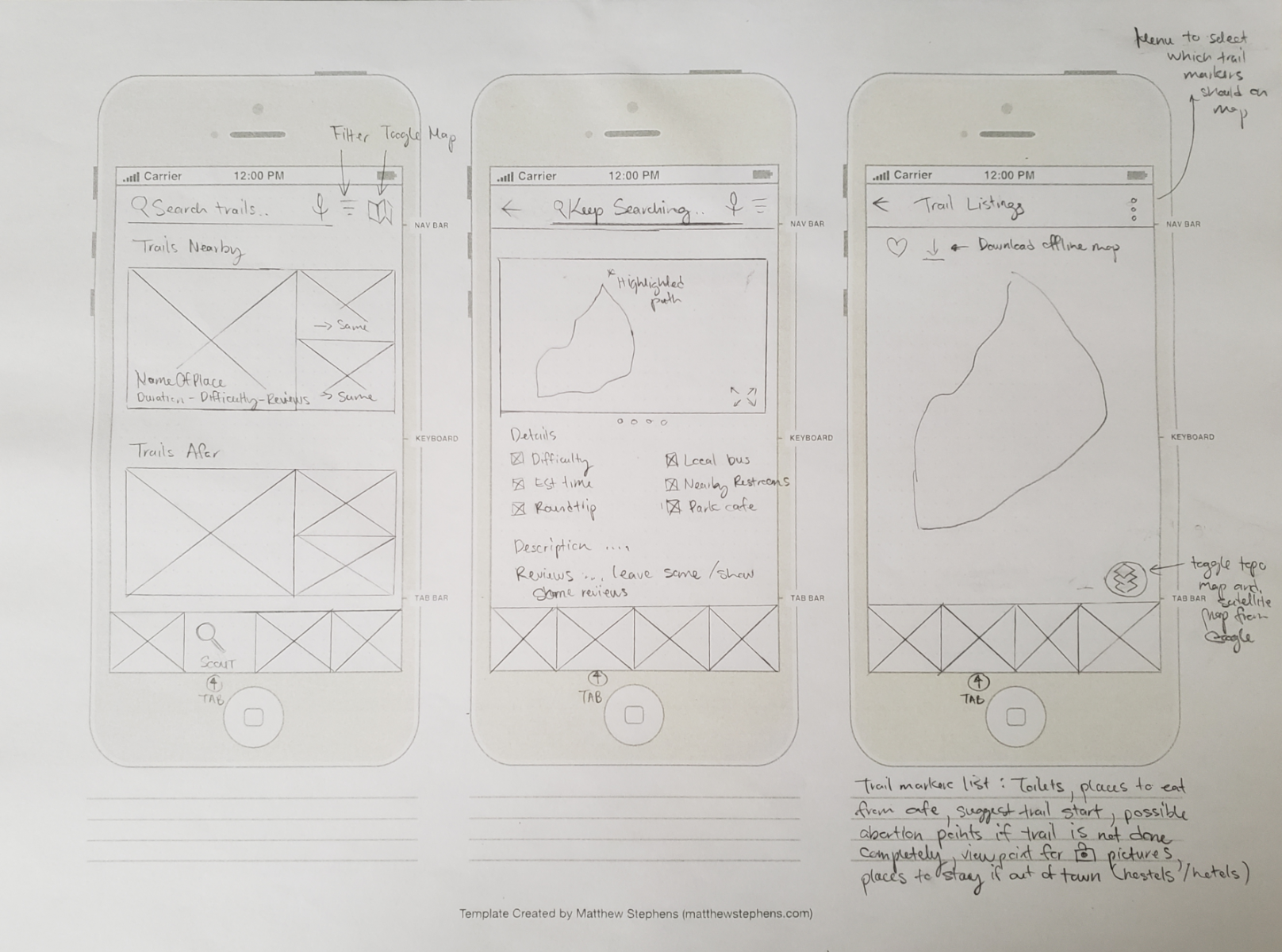
For the UI colours, I deterred from all the green, gradient blue-green, or brown. I wanted the app to stand out against the competitors and be super functional, so I chose to use a blue monochromatic palette. The blue colour chosen was based on both scientific and psychological reasons. The scientific reason was that the blue seen in the mountains is an optical illusion of scattered blue light in the atmosphere from the sky. The psychological reason was that it creates an emotional design for physical and mental wellness. When I was drafting up the UI screens, XD's prototyping, plugins, and link sharing were the magic. I was able to get the animations and functionality of XD to work to a certain extent, I got to understand mobile gestures and adding motion to the user experience of the app. I overcame the limitations of Adobe XD by resourcing from Figma and Sketch. Their library base of plugins and UI kits were plentiful. The other part of the design process was me eyeballing finger tap distances and previewing the design in real-time to my phone. I was ensuring Fitts' Law, Hick's Law by reducing signal-to-noise ratio, mobile patterns for affordances, and other usability factors. Scenario-based consideration of adding dark mode was ideated too. A hiker is going through the shaded trails and may want a default white theme, whereas hiking going through a clearing on a sunny day may want to switch to a dark interface to use the app. Getting close to the deadline, I re-strategized my product lifecycle and wrote a success roadmap. I needed to write a new plan for milestones and implementations. My first deliverable product should involve the first and last tabs of the bottom navigation bar: Plan and Profile section. I considered the Peak-end rule as my advantage to showcase the app demo to my users in user testing. If I can't give the whole app's customer experience, it's better if I test the start and end tabs to validate the idea or go back to the drawing board.
From the project, I can see that the bottom navigation has many functions with each tab. It made me consider how heavy the app will be for users. Usually, when you get lost or feel unsafe, your phone is your perceived lifeline. So how much money do Canadians have to spend on data to use the app? Will this be a problem or can they just download the necessary information to their phone to use offline. I tried to limit my main tasks on each screen to 1 or 2. I could see my design needing 2 thumbs to manage the app, since the design for one handedness was not fully there yet.. As I was progressing the project, I think that high fidelity wireflows would provide more in depth visualization of the screen user flows. The user flowchart helped me visualize the big picture, which was that I needed to break down each tab further. From this project, I learned more about MVP and applied the lean startup methodology to the product lifecycle to keep building on an agile phase. I also learned to use MDC components best practices; Web or mobile components are known as groups of UI elements. I got confused with that term initially, as UX/UI software wording for components refers to the workflow of reusable styling. I also stepped into the world of states in prototyping. If time permitted, I would do the following tasks: ← Airbnb Reviews - Long Writeup Non-Profit Causes: Volume 1 →Outcomes and Lessons