
Highlight: Web UX/UI + Ethics - Speculative
Categories: UX Research, UX/UI, Branding
Roles: User Researcher, UX/UI Designer, Brand Storyteller
Participants: 5 qualitative interviews
Tools: Figma for the design process, Sketch for UX artifacts, XMind for site mapping; Web Inspector for secondary research, and UX/UI mockups; Maze for usability test
Duration: 2.5 weeks, 100 hours in March - April 2020
*** Note: Speculative accessibility project, no affiliation with the non-profit ***
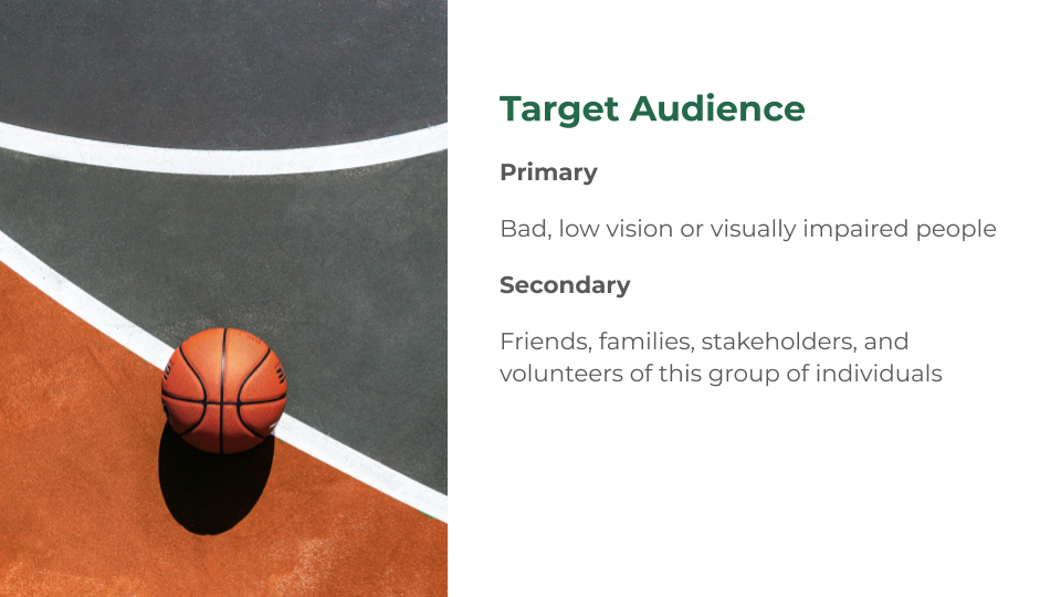
BC Blind Sports & Recreation Association (BCBSRA) is a provincial chapter of Alliance for Equality of Blind Canadians (AEBC). They offer programs and sports to those who are blind or partially sighted. The not-for-profit organization is funded by the province and CanadaHelps. BCBSRA’s online website needs to be refreshed and reflect the needs of the website’s users. These users include the visually impaired or blind, their family and friends, volunteers, sports coaches, and partners of the association. Also, the update would create more credibility and shows that the organization is changing with the times, which may result in more donations from the public. Problem: Scope and Constraints: The scope included user research, planning website layout, designing the UI, usability testing, and making changes from analyses. There were time constraints to produce a responsive website in approximately 2.5 weeks or approximately 100 hours. The user recruitment and remote usability testing phase resulted in a shift in the research plan and priorities. The scope was large as it tackled the idea of accessibility and inclusion for ethical design. Challenges Faced: It was a challenge finding the right group of individuals to test the website, so simulated testing was completed. Simulated testing involved selecting individuals with poor vision (i.e., requiring corrective lenses) to test the website. These individuals represented the visually impaired users navigating the web. Also, I was unfamiliar with simulating remote user testing. Specifically, under a low vision environment, with or without assistive technology. There was a steep learning curve with this aspect of the scope.BC Blind Sports Accessibility
Prologue: I pitched the redesign project when I just started learning web design 12 years ago but forgo for the project management scope because I was a beginner. Self-aware of where I am now, plus my past interaction with the non-profit, I took responsibility to design for ethical design.
Accessible inclusive design is not fully met without the proper usability test with the end-users.
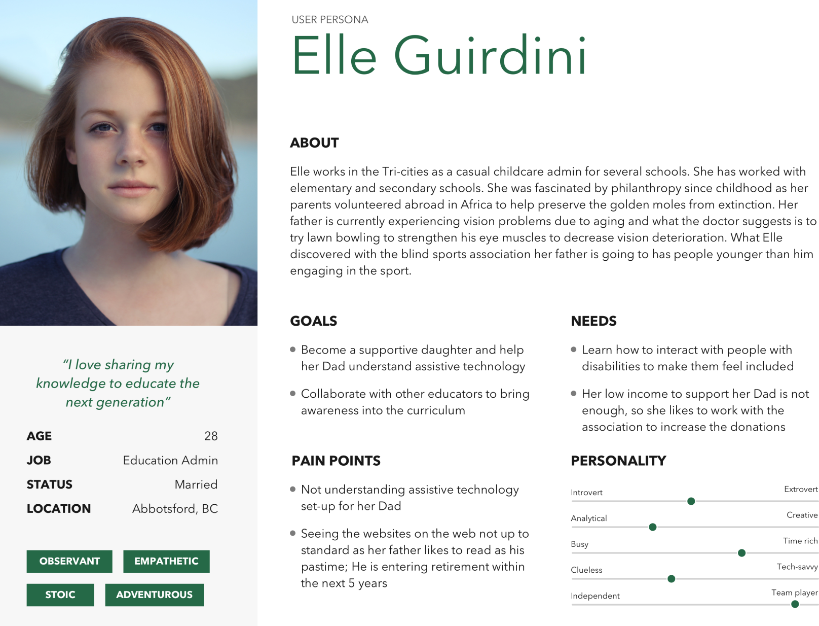
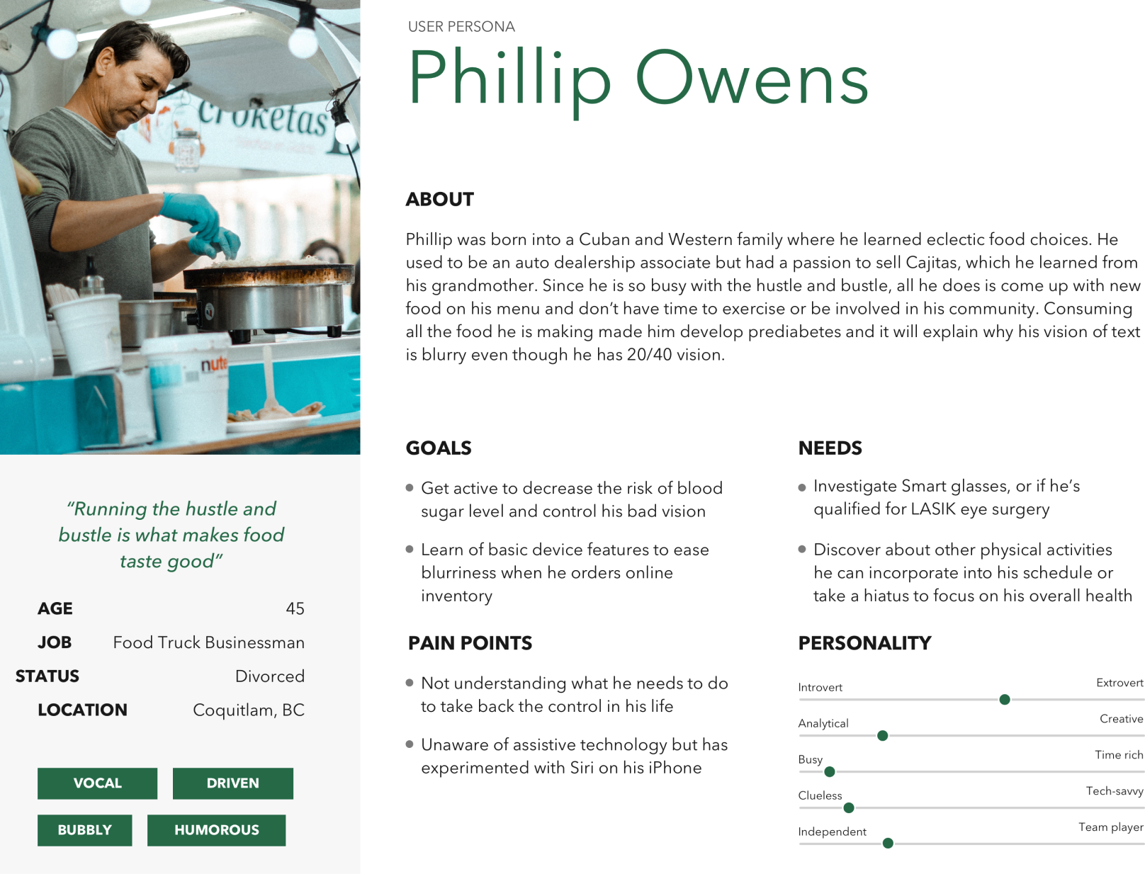
I had three research goals for the website refresh. The main goal was to understand what individuals with vision problems want, need, and desire from the site. There weren’t many candidates at hand during the COVID-19 shutdown. This resulted in focusing on my secondary goal of determining ways to increase membership enrollment, volunteering, and donations. The third goal was to get the general public interested in the paralympic sport, goalball. I changed the user research from individuals with vision problems to individuals with poor vision. I did one-on-one interviews and tried to categorize their experience under three key topics: After refocusing, I established the preliminary target audience and completed the competitor SWOT analysis, minus the “opportunities” and “threats” elements. This resulted in two personas, caregiver archetype, and mid-life health crisis archetype. Because being profitable is not a goal of non-profit organizations, I decided my focus was not to compete against other non-profits. However, I will use other non-profits as a model to improve BCBSRA’s outdated website design and self-marketing.Research Definition
Research questioning was completed using these categories instead of a non-connected story method because BCBSRA’s primary need and focus are in these areas. I did not divulge the name of the non-profit organization to the users I researched as they were part of my pool of candidates for UI usability testing.
for Competitive Analysis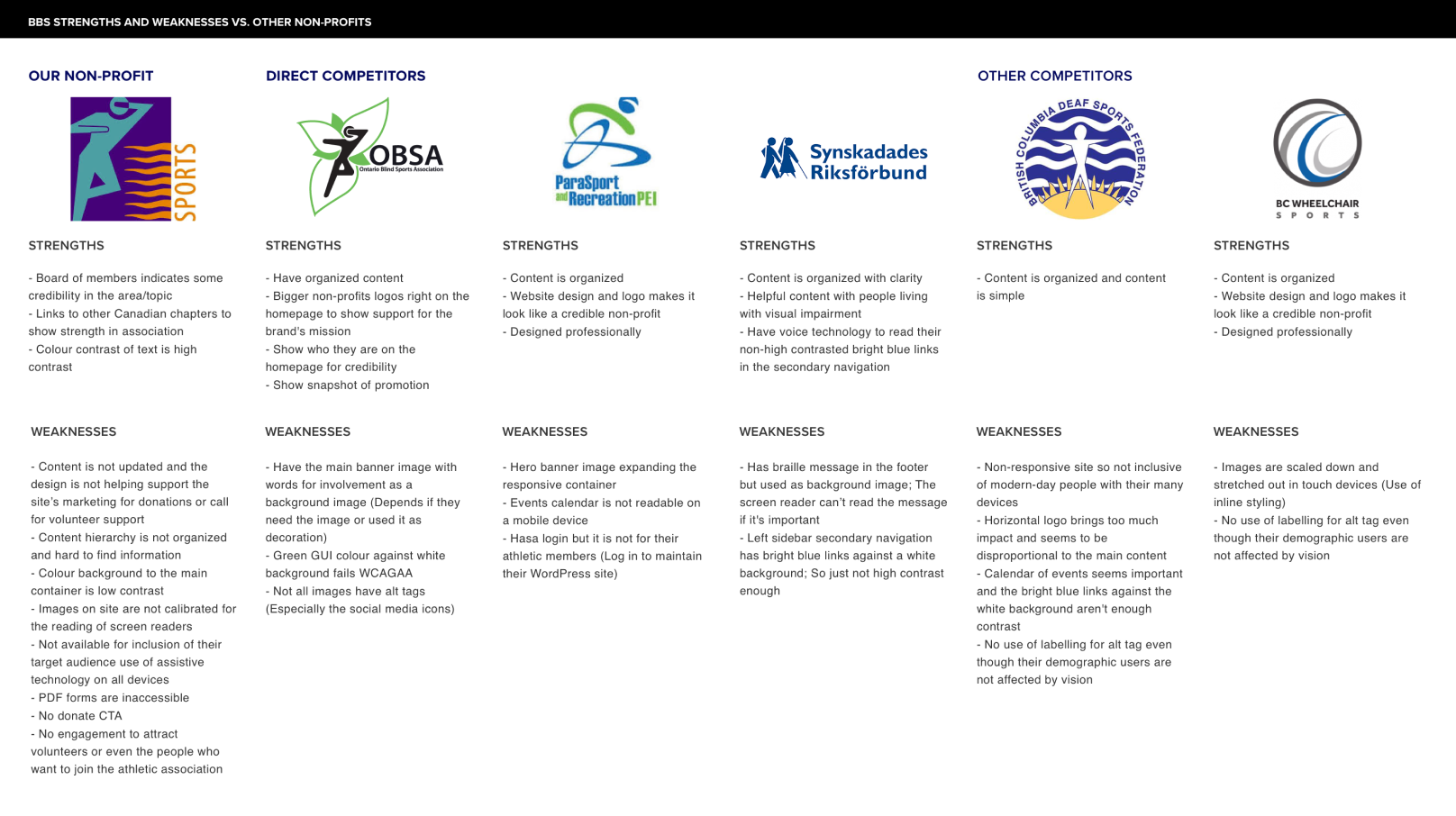
Solution Planning
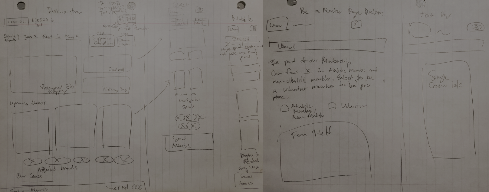
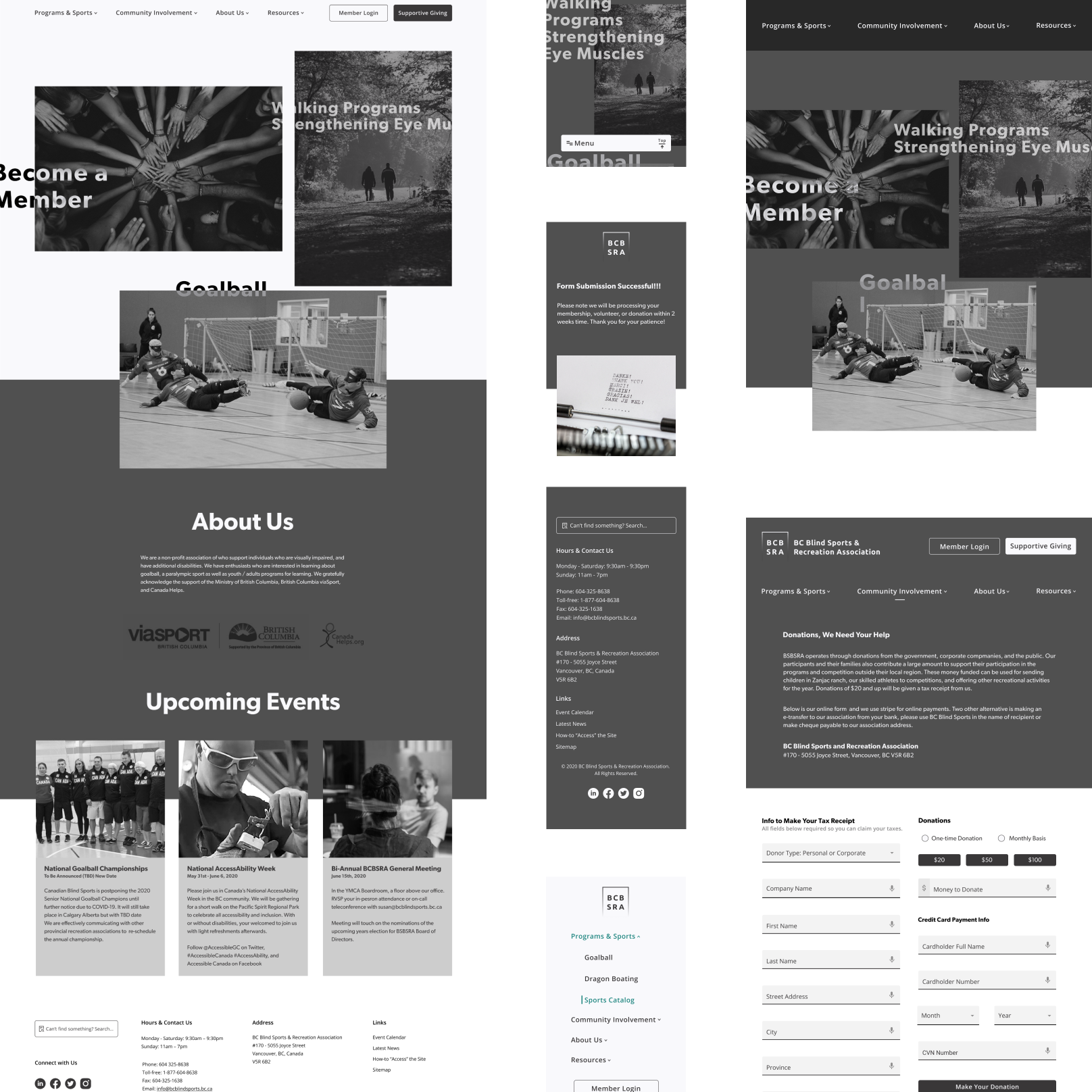
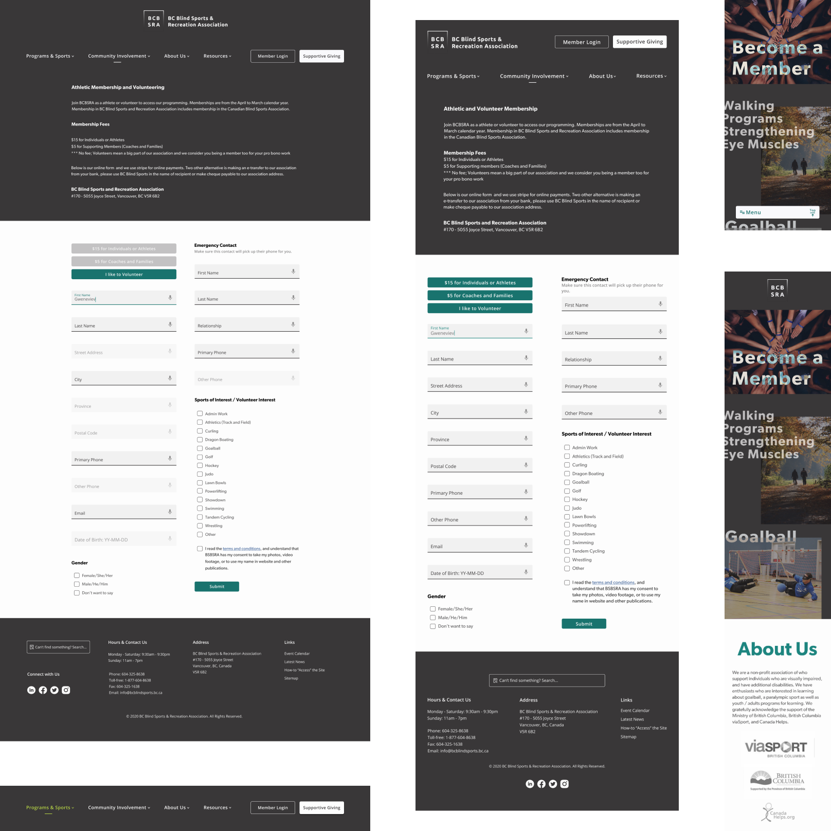
When I was planning the solution, I did a lot of secondary research for accessibility, such as choosing the right typography and spacing. I also gathered feedback from other designers on how to go about creating a plan, especially for remote usability testing. My initial idea was to set the colour palette of black, white, and grey for contrast in readability, and make the site more usable overall. Also, I thought the brand logo redesign needed to use the human running shape, similar to Canadian Blind Sports or Olympic sporting logos. I discovered similar associations used braille in their wordmarks on the web and wondered if that is a standard I should aim for. For the brand refresh, I came up with three sketch concepts: I explored the three concepts along with three different sets of typography that I had chosen. My experimentation allowed me the opportunity to apply visual degradation to brand wordmark. From that point on, I knew what my interface strategy should be: Tell the story that any vision problem is just black, white, or shades of grey. The major art direction encompassed this strategy, while the colour direction of minor art was kept to a minimum. I revisited my initial website concept sketches and decided to reshift the UI elements needed on the site. One element was the three-part masonry mosaic gallery for the homepage. I found the grid to be too perfect. Instead, I used an asymmetrical gallery grid to demonstrate the imperfections about the topic of the website. This was a deliberate art direction to show sighted people design under a magnified view. I wanted to use the maxi typography with an imperfect asymmetrical blown off-grid as a statement. The entire site overall used the broken asymmetrical look. From there, I moved on to creating the membership and donation forms. I incorporated Google Material Design's VUI for form accessibility. I encountered a colour contrast issue due to my design elements having varying opacity and the Stark plugin not operating on my computer. To solve these issues, I went to the old school developer way and plugged the CSS RGBA colours into Firefox web inspector to test Web Content Accessibility Guidelines (WCAG) AA. Another aspect of website accessibility was graphics and content order. I applied a graphical focus to headings, as well as organized website content so that the content would be accurately translated by a screen reader to the user. This resulted in my designing the structure and content of the website without CSS, as well as visualizing the HTML semantics while I designed. I extended the UI concept of graphical focus to the website’s search function. Then came the biggest challenge to execute, the usability testing (Medium post coming soon). Honestly, I did not know how individuals with poor vision would do the remote test under the environment I requested. My requested environment was either blindfold themselves to do the usability tasks or dim their screens. Even though I checked their distance from the screen and trusted the screen dimness self-reporting on Google Hangouts, I felt I was missing depth from guessing the distance from the computer screen camera to their face. I came up with the gear to test for low vision and even colour blindness but all it took to get the results was to get my users to take off their glasses and dim their screens to <50% brightness. I found that less than 25% screen brightness with no glasses was ideal. I acted as the users' personal Google Assistant and read task questions aloud. I also provided support to the users when they verbalized their actions when they had questions but I did not direct them on how to complete the task. After usability testing. I made high priority changes to the content to clarify confusion between membership and volunteering. I made form fields disabled for certain primary and secondary audiences when I attempted to make only one sign up form for membership and volunteering. For demo purposes of functionality, the disabled UI shows what buttons and form fields don’t exist in the interface once the filterable buttons are clicked. It will not affect the accessibility standard I set for the website as a whole. The "devil's advocate" design seems to communicate the rawness in ethical design. I did only 50 - 75% of the legwork. The remaining work included coding and design to fully achieve accessibility and inclusion. The website colour contrast and size is set according to WCAG AA for non-sighted and sighted people. From the usability testing, I could see all the research goals being accomplished except the third goal of getting people interested in goalball. Dragon boating spiked more interest than goalball. The lesson I learned from this project was there had to be fluid and agile communication between all involved, including that between users, designers, lead designers, developers, project managers, and clients. Open communication will result in achieving a responsive and accessible website. Furthermore, I need to be careful with the content microcopy as well as the main content. From the usability test, I saw F-patterned eye-tracking was important to the 2 column magazine layout where the form fields were. I have to reduce the long-form fields even more than what I had ideated. While self-reflecting on the project as a whole, I see that my overthinking and worry about the subject did not help solve the lack of inclusion or accessibility. I understood that I could not solve the larger issue of inclusion and accessibility for all but it was still difficult to continue with the website refresh. After I stepped back from the project, the results just miraculously came through. Also, I would like to experiment with Google and Firefox web browser’s built-in accessibility tools. I recommend another roadmap feature at the top of the banner notifying users of the built-in tools. It would say, for example, "Hey, do you know we have built-in browser features to help you navigate the web better." From my point of view, I think Google and Firefox built more usable accessibility features for computer users than our mobile phones. I tried the various accessibility and usability features on my mobile phone and browsers. I became frustrated when using the screen reader on my Android phone as it required a lot of double-tapping, it locked my viewport and it prevented vertical scrolling on web pages. Plus, having to unlock my phone under voice assistant mode was a nightmare. If time permitted, I would do the following tasks: Related Projects ← SHOEME PWA - Short Writeup Airbnb Reviews - Long Writeup →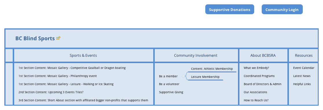
Solution Execution
![]()
Test Findings: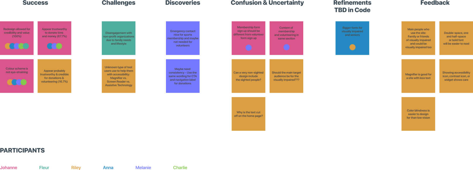
Outcomes and Lessons
Check-in of how it's going: BCBSRA has updated their website for accessibility in 2021 and I'm so glad. Even though I didn't design it, I am glad I took a chance to apply my learnings of inclusive and accessible design in 2020. ♥